Wings Forever Web
Project Overview
Objective: Improve website usability, accessibility, and visual appeal while ensuring a seamless experience for families seeking educational and recreational activities.
Old design
.png)
.png)
Research
User personas
As part of the research phase, we created user personas to better understand and empathize with our target audience. These personas were based on interviews, surveys, and observational insights gathered from real parents and caregivers who are actively seeking educational and developmental opportunities for their children.
Two distinct personas emerged:
Jakub and Petra Novák, parents of a toddler, represent families looking for playful, age-appropriate learning experiences that fit into their busy routines. They need simple, curated resources and value opportunities that can be enjoyed together as a family.
Martina Horváthová, a mother of two school-aged children, represents users seeking structured, reliable educational programs—specifically English language courses. She values clear, localized information and relies on parent recommendations and testimonials when making decisions.
.png)
User research insights
Goals of the Research:
- Understand how users interact with the current website
- Identify pain points, barriers, or confusion in completing tasks
- Explore emotional responses to design elements and overall brand trust
Clear navigation
Enhanced accessibility
Dynamic Updates
Ideation
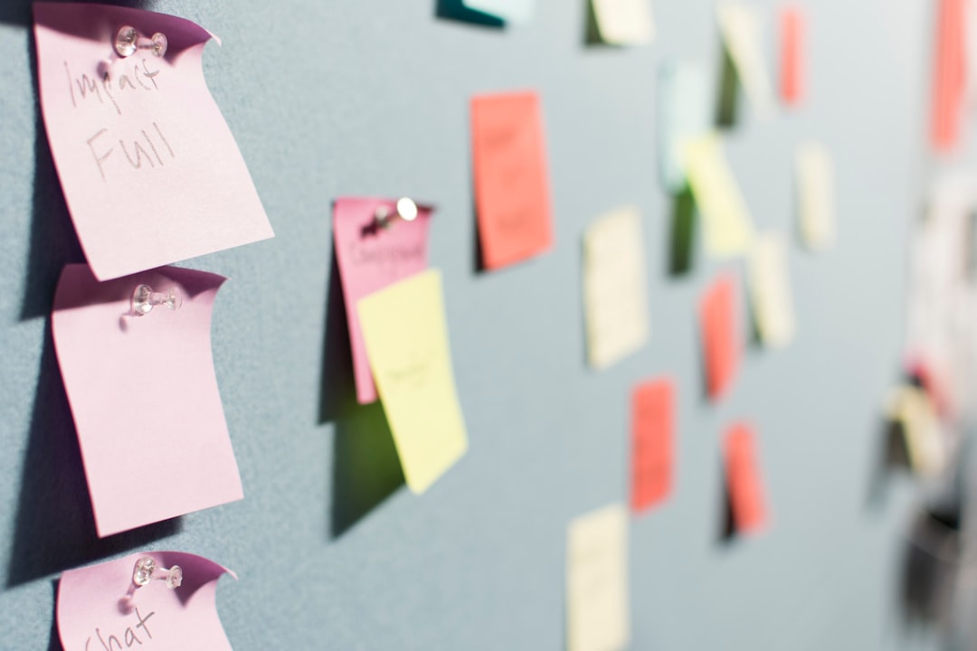
How Might We
- Design distinct landing pages for each theme with curated content, relevant links, and a clear call to action (CTA) for deeper engagement.
- Include searchable libraries of resources like articles, videos, and downloadable materials that are regularly updated.
- Feature stories or case studies from community members who have benefited from each program to enhance credibility and engagement.
- Utilize menus with clear, organized sections that visually display the content available under each top-level navigation item.
- Implement breadcrumbs on all pages so users can easily see and navigate to higher levels of the site.
- Add quick links or a sidebar on the homepage that directly connects users to the most frequently sought pages or resources.
- Place social share buttons prominently on all key pages, especially on blog posts, success stories, event pages, and resource sections.
- Allow users to sign in to the website using their existing social media accounts, streamlining the registration process for forums, comments, and event sign-ups.
- Launch interactive social media campaigns
Design
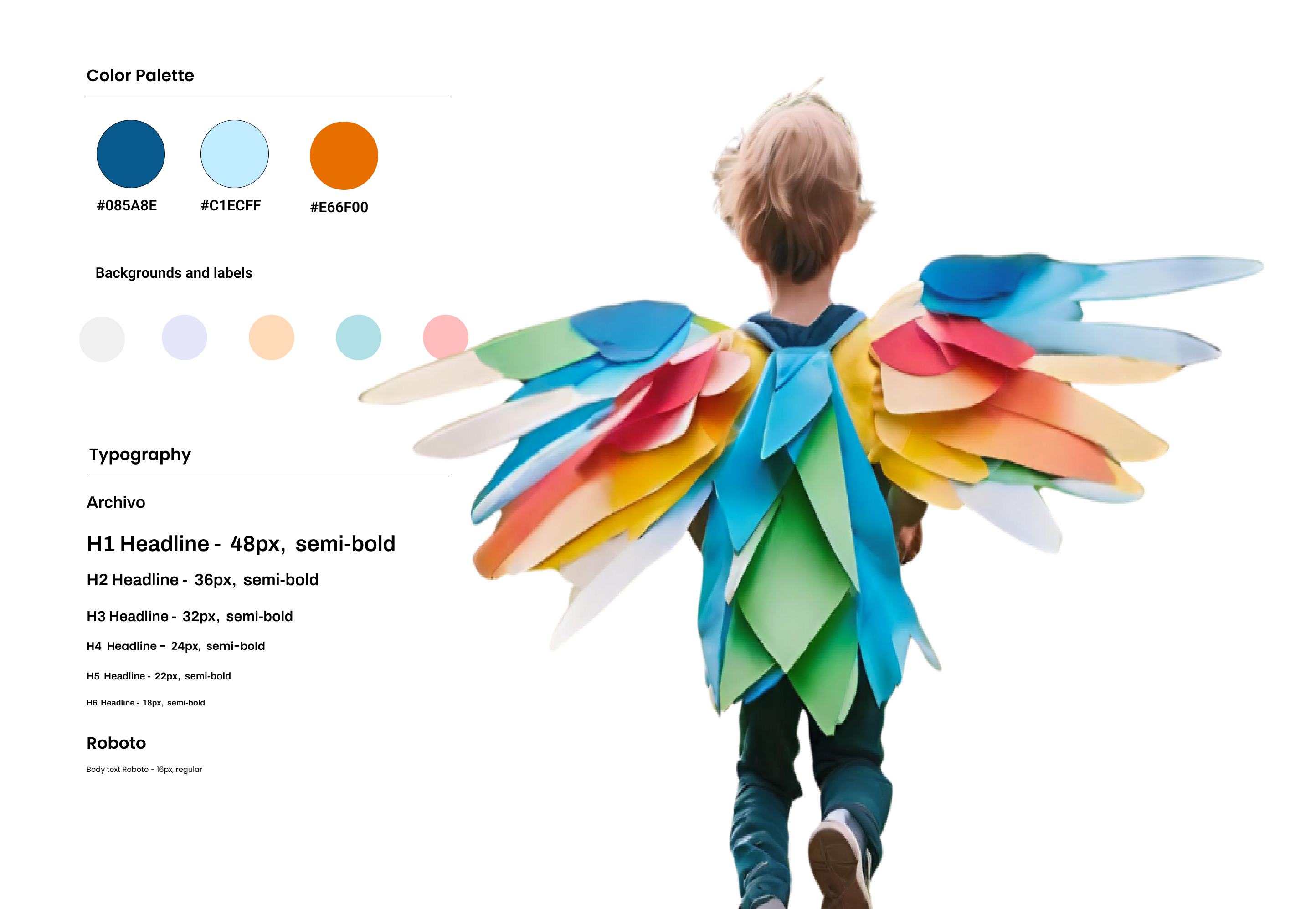
Typography and Colors
Modern Aesthetic
A clean and contemporary design with a focus on usability and visual appeal.
Calendar and Events Section
Prominently featured on the homepage, allows users to easily find and participate in upcoming events and activities.
Equal Representation
English lessons, family center,
non-profit collaborations
Key Features
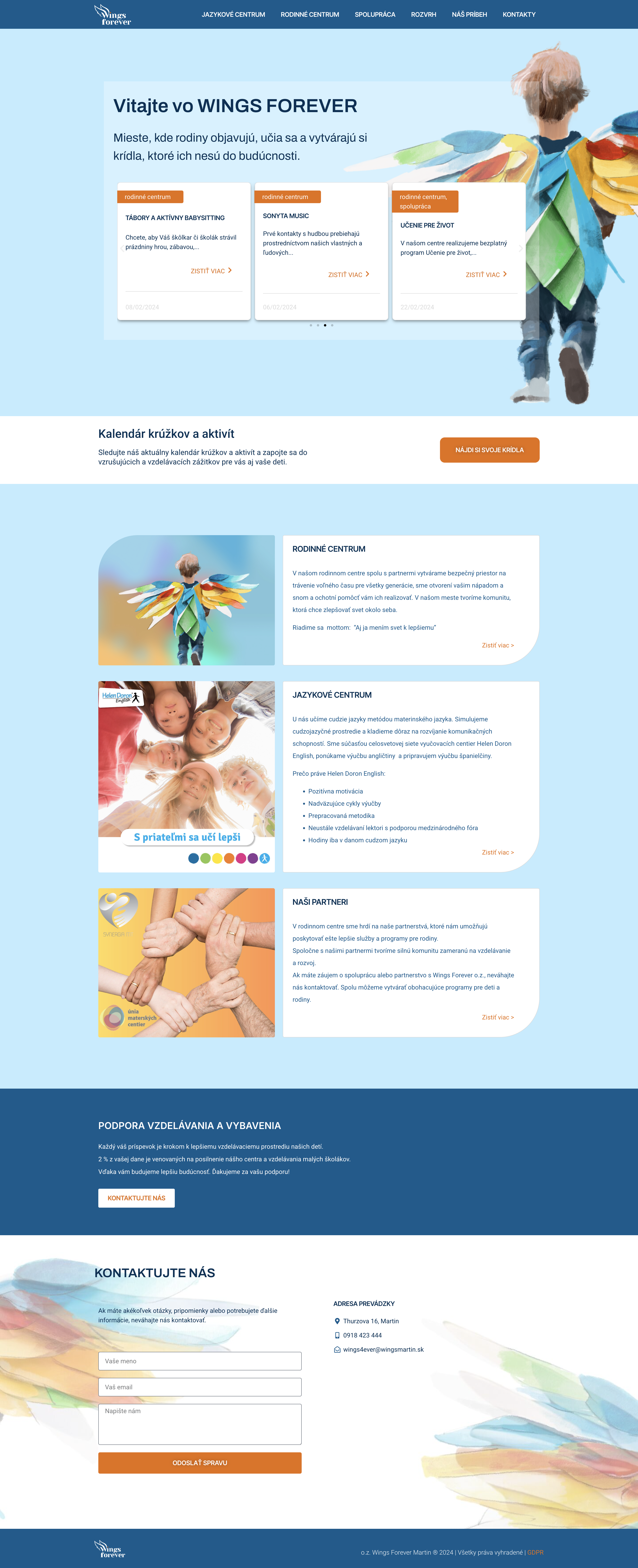
Modern & Clean Aesthetic
Before: Outdated look with cluttered layout and inconsistent design elements.
After: Clean, minimal layout with generous white space, a soft color palette, and modern visuals—especially the beautiful watercolor-style wings and child imagery that reinforce the brand theme.
Visual Hierarchy & Readability
Clear section divisions, improved font choices, and consistent font sizing create a smoother reading experience.
Use of bold headings and cards helps users quickly identify key areas like services or upcoming events.
Improved Navigation (UX)
The top navigation bar is simplified and reorganized:
Jazykové centrum | Rodinné centrum | Spolupráca | Rozvrh | Náš príbeh | Kontakty
The layout now supports scroll-based exploration, making it easier for users to find info without digging through outdated or crowded links.
Use of Cards & Sections for Services
Each program is clearly separated into interactive cards.
This card-based UI improves scannability, and the "Zistiť viac" (Learn more) buttons support micro-interactions.
Consistent Branding & Imagery
The wings motif is used consistently in both visuals and theming, aligning with the name “Wings Forever.”
Professional photos replace generic clip-art or bright shapes used in the older site, creating a more emotional, human-centered design.
Better Contact Section
New form includes input fields with labels, a call-to-action button, and contact details clearly displayed.
The background wings and gradient give a friendly, airy feeling while still staying professional.
Reflection and takeaways
Working on the Wings Forever redesign was not only a creative challenge, but a personal one—balancing emotional storytelling with practical usability. One of the biggest lessons I learned was how important it is to design with empathy, especially when your audience includes parents, children, and caregivers. Every color choice, font, and layout decision needed to evoke trust, warmth, and clarity.
More Projects